A brand‘s logo is crucial to its image and today we will be talking about one aspect of the logo – The Color; namely, Psychology Of Colors In Logos. The colour chosen to represent the brand isn’t a random pick from a box of crayons, each colour has a specific meaning and helps brands portray their image visually. So here are 8 colours and what they represent.
-
1 Black
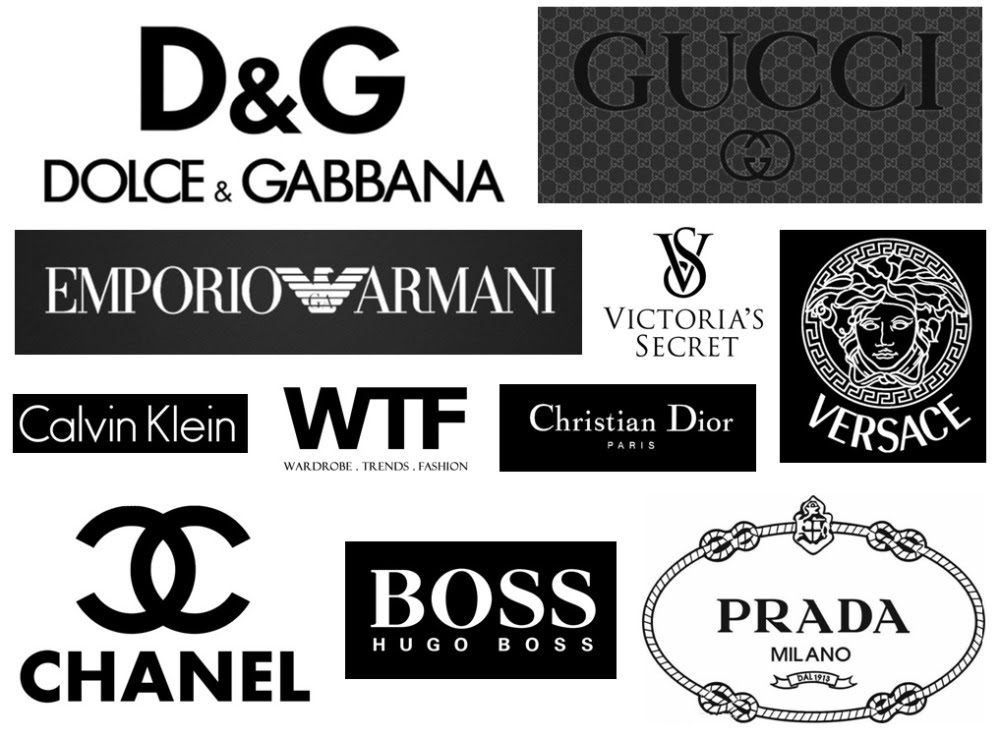
The colour Black is associated with power, elegance, formality, and mystery. That's why we see most of the luxury brands represented by the colour Black.
-
2 Blue

Blue calls to mind feelings of calmness or serenity. It is often described as peaceful, tranquil, secure, and orderly. Blue is often seen as a sign of stability and reliability.
[quads id=8]
-
3 Green
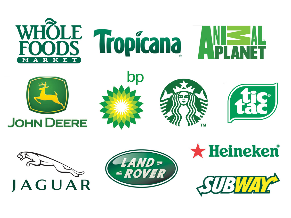
Green, the color of life, nature, and energy, is associated with meanings of growth, harmony, freshness, safety, fertility, and environment.
-
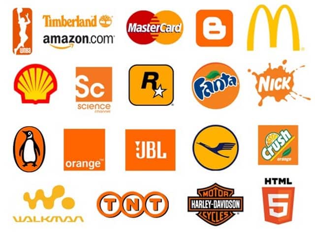
4 Pink
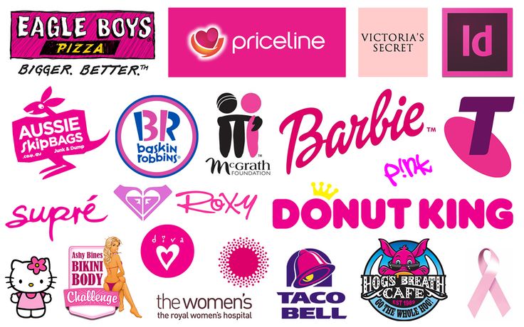
Pink represents a gentle type of love and has a calming effect on people. It is not aggressive but rather suggests safety and vulnerability.
-
5 Purple
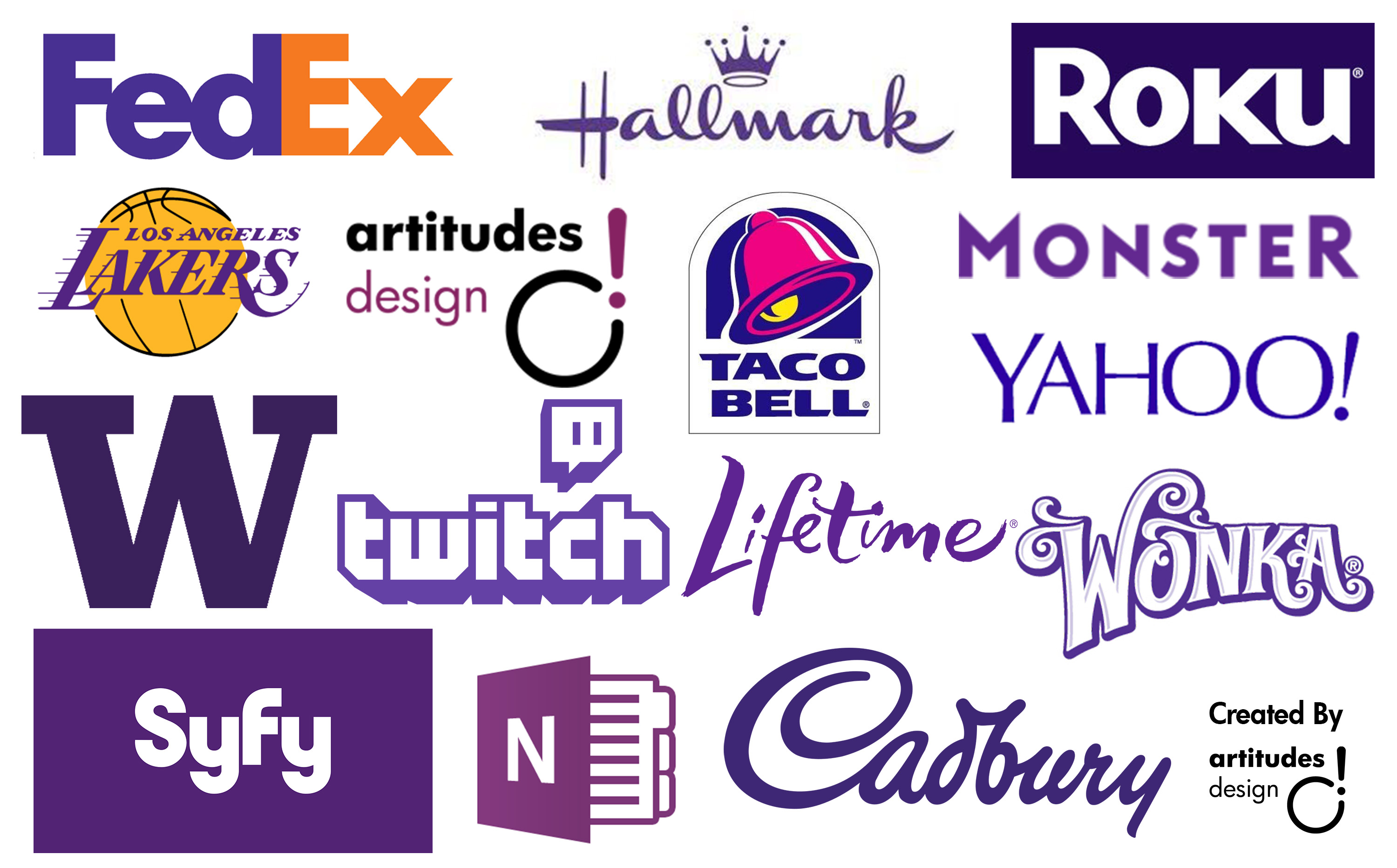
Purple combines the stability of blue and the energy of red. Associated with wisdom, dignity, independence, creativity, mystery, and magic.
-
6 Red
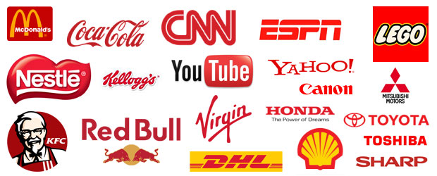
Red is associated with energy, strength, power, determination as well as passion, desire, and love. It attracts attention more than any other colour.
-
7 Yellow
Yellow is the brightest colour of the visible spectrum, and it is the most noticeable of all colours by the human eye. It means happiness and optimism; it is the colour of sun shining, or bright light and creativity. It is the colour of high energy, enthusiasm, hope, fun, and cheerfulness.
-
8 Gray
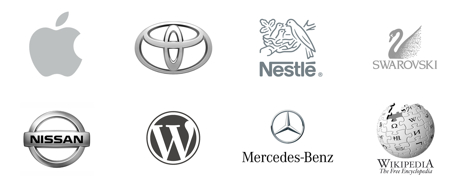
Gray is a cool, neutral, and balanced colour.
Topic: Psychology Of Colors In Logos