Hola King lovers!
Burger King has been campaigning actively since late 2020. In the first days of 2021, they didn’t only change their logo but also renewed the design of all the restaurants and employer uniforms. 3N From Burger King. Don’t forget to follow Marketing Birds to avoid missing out on shares like this. @marketingbirds

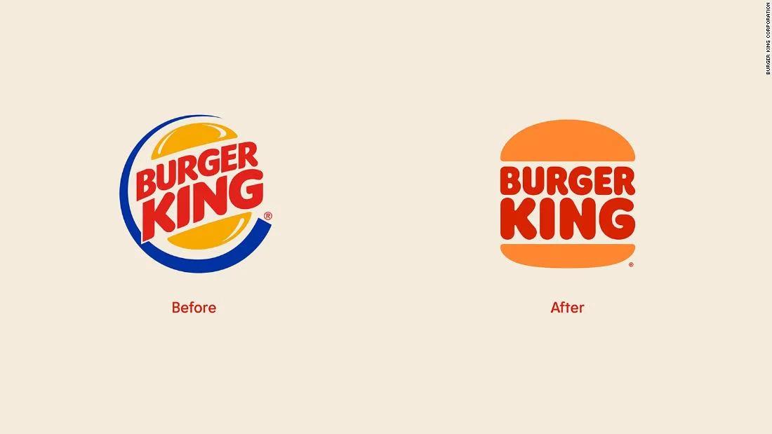
What do they want you to feel when you look at this logo? They moved away from the spiraling blue ribbon to a more retro look inspired from years 1969-1999. The warmth and toning of the colors are selected to be striking, giving “real and delicious food” vibes. Yhe font they used, “Flame”, can be defined as “rounded, bold, and yummy.” You see, they are again inspired by King’s delicious and rounded dishes.

As told by Douglas Sellers, executive creative director at global branding firm Siegel+Gale, “given the current state of the world, the new identity feels warm and familiar” and it’s still recognizable anywhere in the world, and the colors “evoke joy and warmth harkening back to their heritage.” These feelings are what we need the most these days, so the logo is effectively designed to invoke happiness and a positive emotional effect.

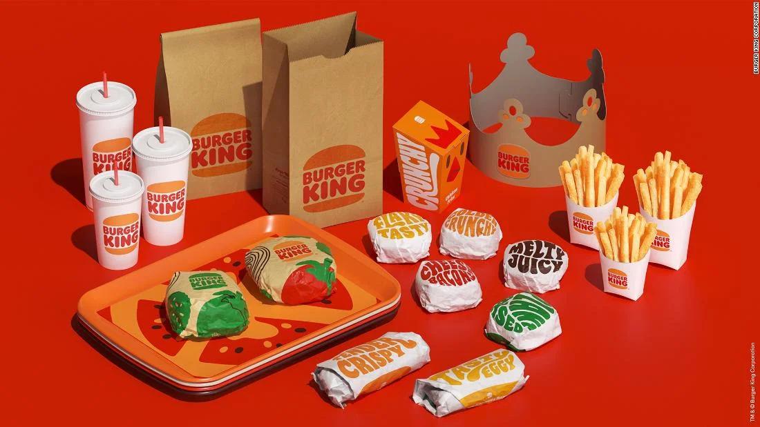
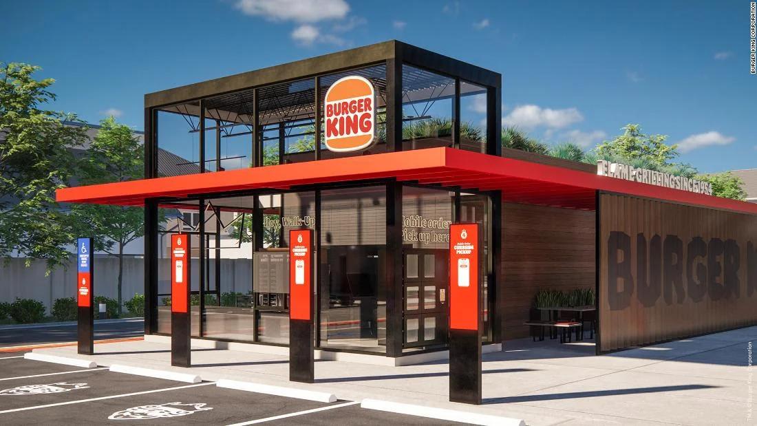
Last September, Burger King introduced triple drive-thrus, burger pickup lockers, and takeout counters, in order to fit the changing world with the pandemic, and they are changing all such designs with the colors of the new logo. These changes are also seen in the visuals they released. Restaurant designs are more modern, cos, and youthful. It’s even reflected in the employer uniforms. These renovations were done as a whole, including the interior and exterior design, uniforms, and packaging, offers more enjoyable experiences to Burger King customers.

According to the expressions of Fernando Machado, the leader of Burger King’s marketing and CMO of Restaurant Brands International, the present logo is optimized digitally, which would make transitions to smartphone applications smoother. Besides, it wasn’t reflecting the fun that’s in the essence of the brand, and the timing was just right to go back to that essence.
All in all, we can say that the brand operated a “back to essence” campaign. Even though there are some negative critics, it recreated itself in a relevant way to the current world, in a creative and attractive way.


