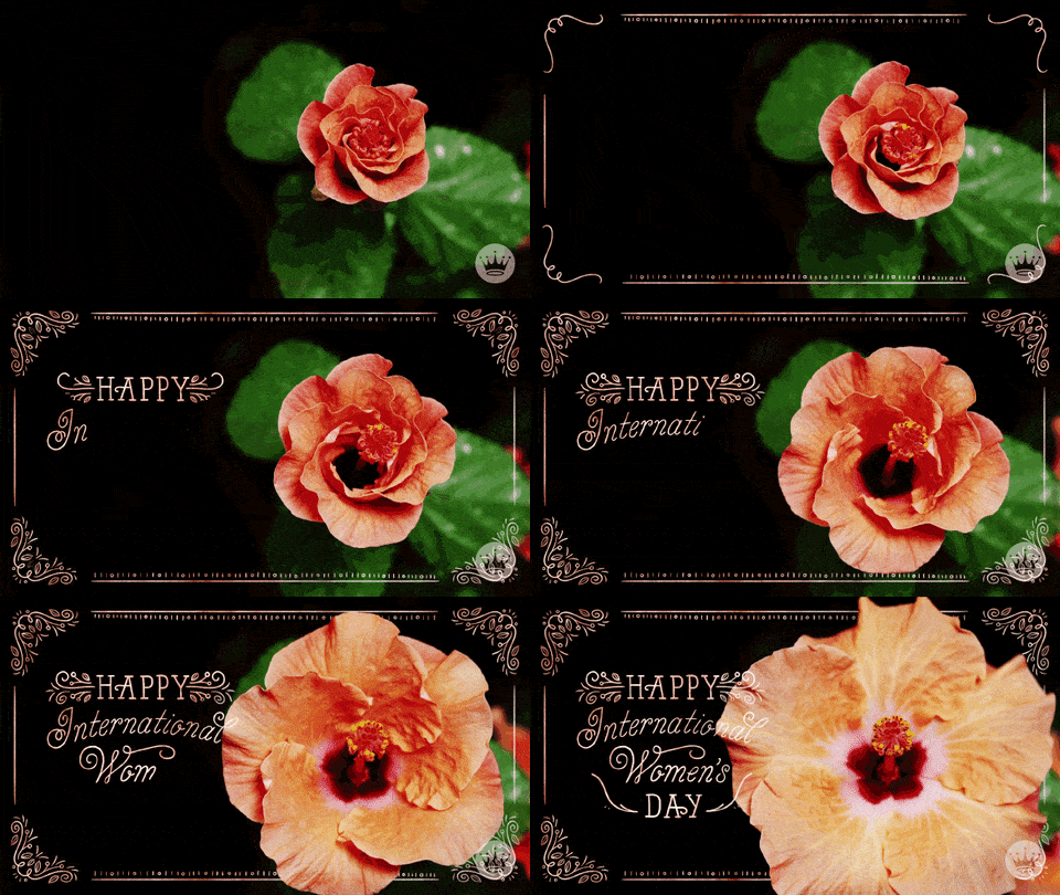
March 8, International Women’s Day is an international day accepted by the United Nations. Every person is special. Men and women are equal. Brands have released female versions of their logos. This special day’s aim is; devote to the development of women’s political and social awareness and to celebrate their economic, political and social achievements. Happy International Women’s Days!
Let’s evaluate this day for brands. Mascots of famous brands are usually men. We can not see a lot of female mascots.
As new brands forge their way into our homes, it would seem that the industry is moving away from gendered branding in favor of a more neutral approach where gender parity becomes a priority, and rightly so. Brands have released female versions of their logos. Women aren’t defined by the color pink anymore, and men like to cook and clean, too. With International Women’s Day on the 8th March, CDA Appliances wanted to do something that would cast a light on these outdated brand mascots and level the playing field a little bit.
You can click here to access our father’s day share!
Let’s see the transformation!
Credit : cda.eu
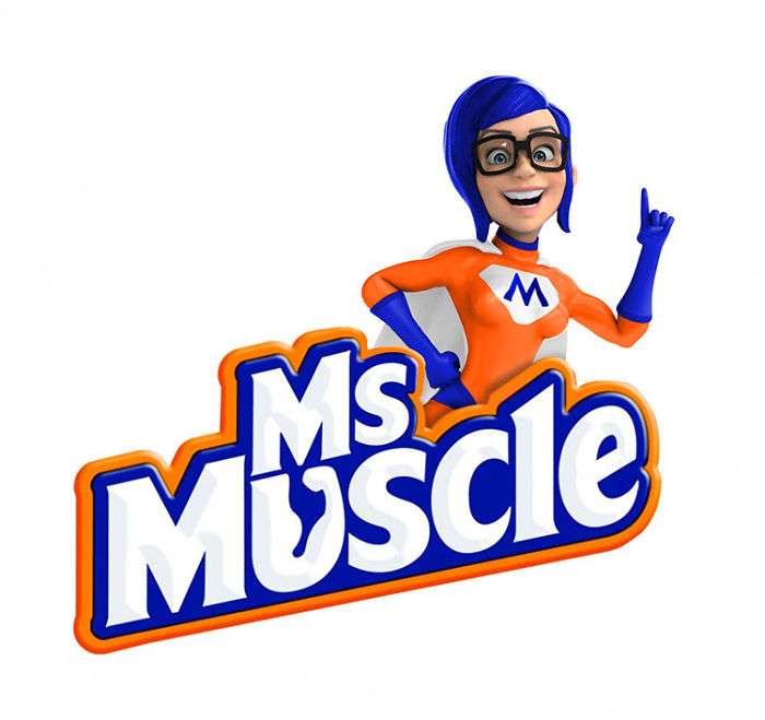
MR MUSCLE
PRINGLES
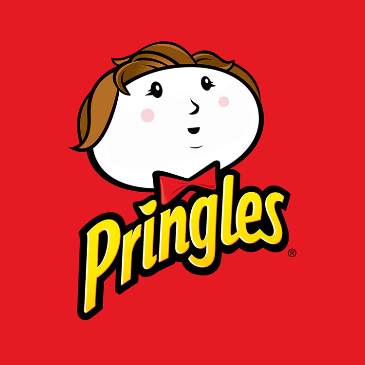
This is Julius Pringles. With his wide mustache and bowtie, the character seemingly represents a traditional gentleman, one that would be in the upper levels of social class – suggesting that Pringles were deserving of a higher status than other crisps. A classy image can also be created without a mustache or bow tie. Just like this woman mascot
FROSTIES
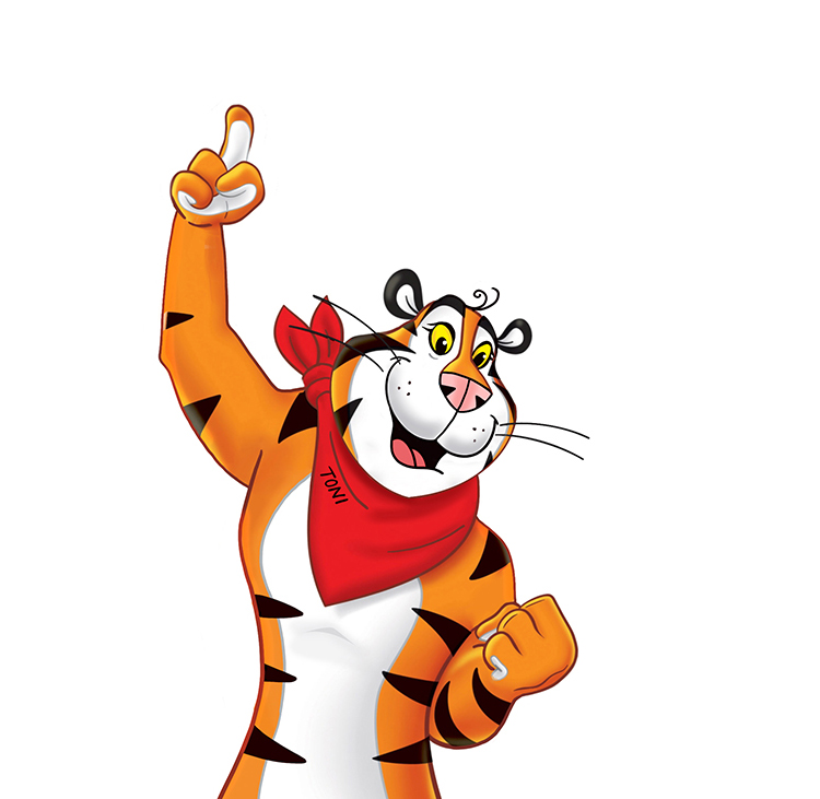
As we mentioned before, the female of the species is seriously underrepresented when it comes to breakfast cereals. Tony the Tiger has become somewhat of an icon since his debut in the early 1950s. The character we see today was created by a group of former Disney animators and was the result of a competition run by Kellogg’s to come up with a new mascot for their latest cereal.
TOILET DUCK
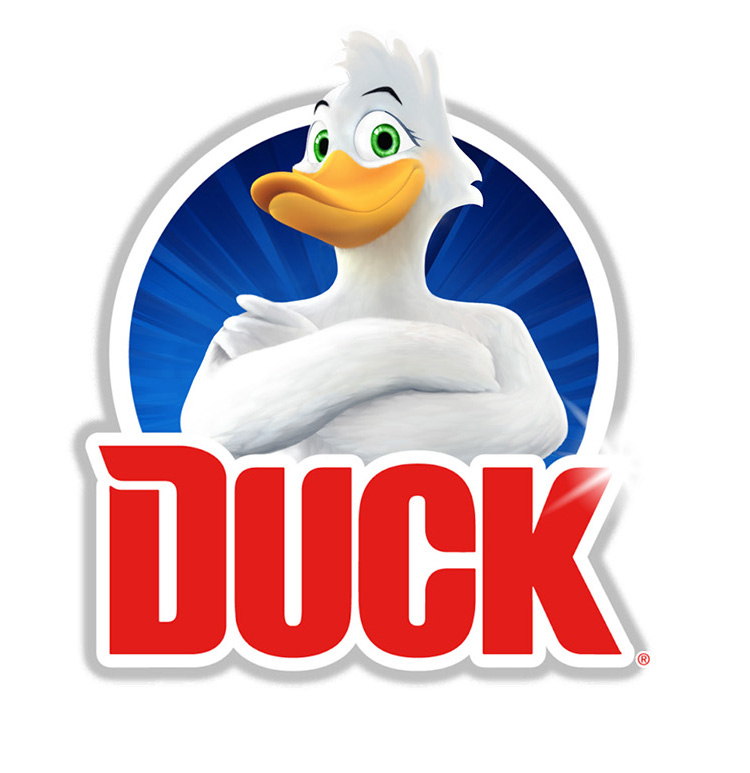
While the branding and mascot for Toilet Duck took a more androgynous form in the beginning, it actually became more masculine over time, leading to the muscular, imposing incarnation we see today. This almost feels like a backstep on the journey to advertising neutrality. In fact, we don't have to use a male mascot for power.
CAPTAIN BIRDS EYE
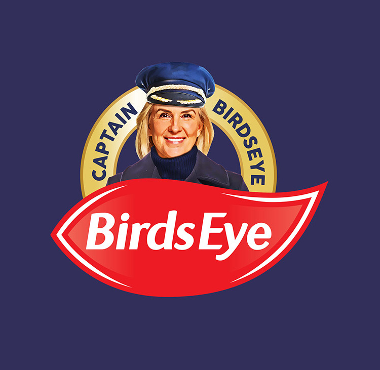
The captain has represented frozen food since the brand's inception. Generally depicted as a clean living, an older sailor with a white beard, it’s a very typical representation of what we’d expect a naval captain to be. These days, the role of captain is no longer reserved just for men and an increasing number of women continue to take up the position.


