Design is everything. Especially, shape, color, and size are the most important tools for brand positioning. Everyone pays attention to its packaging before buying something. So, we can say the package is the first impression. The shape is important for the usefulness and functionality of the package. Pringles is very different from other chips brands in its original packaging form. The oval shape prevents chips from breaking and provides convenience. Toblerones’ shape (like mountain shape) is different from other chocolate brands’ shapes. You can easily break these “mountains”. Also, colors affect our view of brands. Black recalls prestige. Green reminds eco-friendly and nature. Pink is purity and romance. Red is energy. Gold color, on the other hand, has the power to remind wealth. But what do you think about gold and black? Most designers and brands like to use this. Thus, we selected gold and black packaging designs. Let’s see if it reminds you of wealth and prestige? Don’t forget to follow Marketing Birds to avoid missing out on similar shares. IG: @marketingbirds
-
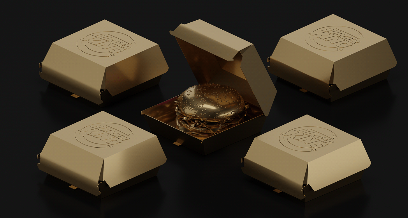
1 Brands Dipped In Gold Water; McDonald's, Pizza Hut, Pringles, Dunkin' Donuts, Coco-Cola, Starbucks, Burger King
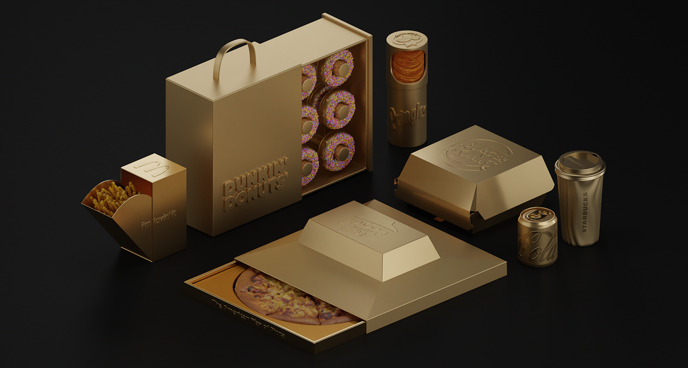
Eslam Mohamed
-
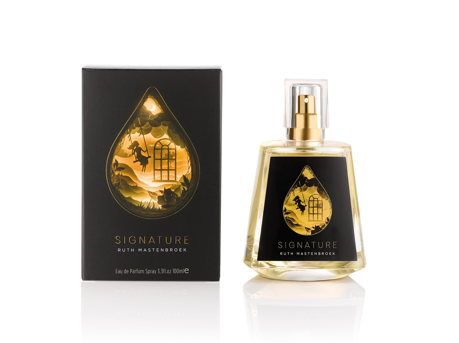
2 Ruth Mastenbroek: Pieces Of Golden Life.

Williams Murray Hamm Agency
-
3 Honey Twist Limited Edition: Gold Design For Golden Honey
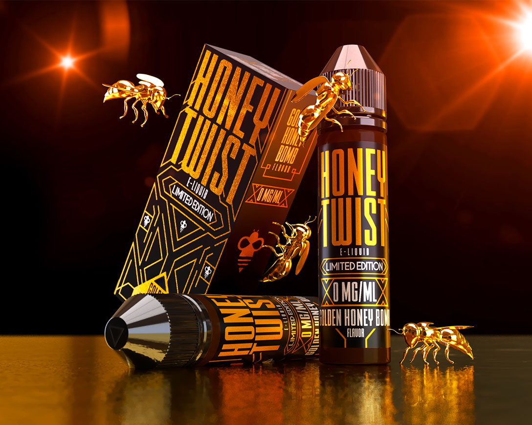
Lory Hagopian / Jonathan Valverde
-
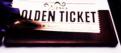
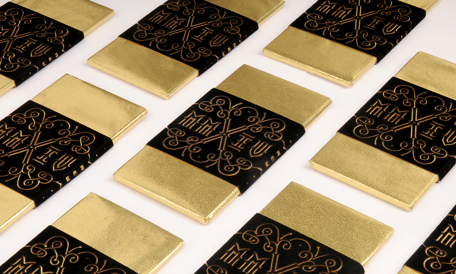
4 Like Willy Wonka: Golden Chocolate Packaging Design
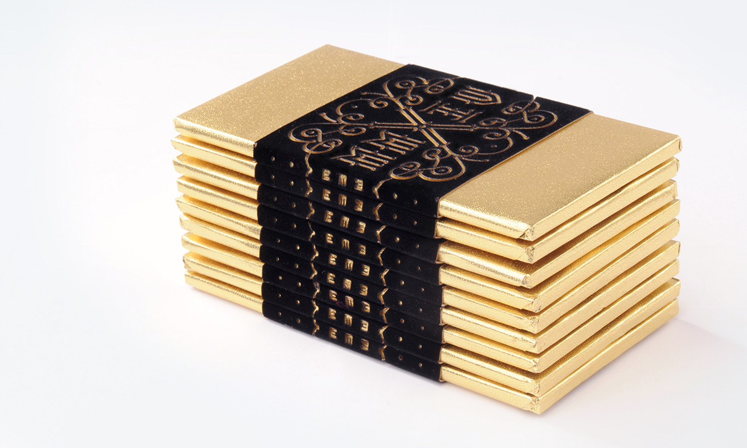
EME Design Studio
-
5 Savage Garden Black Tea- Harmony Of Black and Gold
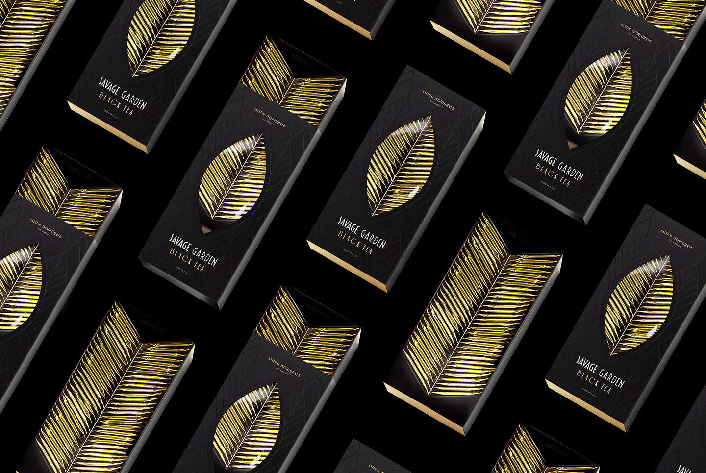
Nikita Konkin
-
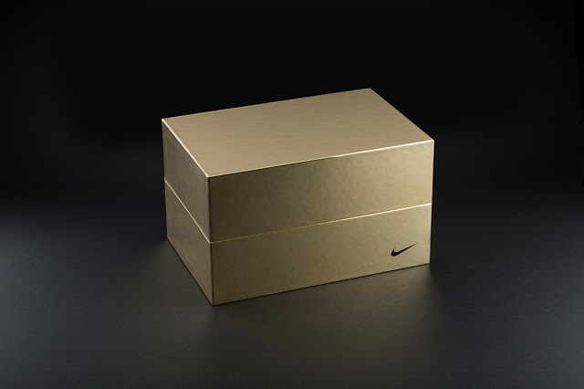
6 Nike's Gold Design For 2014 Opening Event
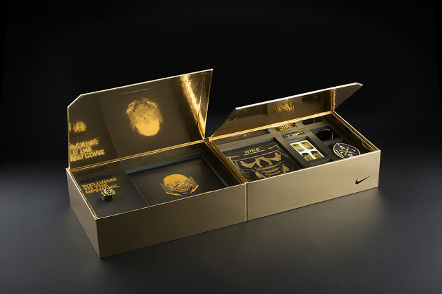
Hovercraft Studio
Are you interested in brands and colors? You can also check out this post: The Spectrum of Brands – Psychology Of Colors In Logos